

Our previous article in the Data Visualization series discussed vertical bars. Today, we want to discuss horizontal bars.
Do not use different shades or 3D rendering in horizontal bar charts, just like in vertical bar charts.
A horizontal multiple-bar chart is similar to a vertical multiple-bar chart. However, it is recommended to limit the number of categories to four or fewer to avoid clutter and make the data easy to read. It's important to assign the shading of the bars from lightest to darkest to make it easier for the reader to compare and contrast the data.
Ordering and regrouping
No random lineup
When creating a horizontal bar chart, it's crucial to rank items by the same attribute, so plotting the bars in a random order defeats the purpose.

The right order
A horizontal bar chart is helpful for ranking items by the same characteristic, like product sales by country.
The bars should be sorted in descending or ascending order. A selected bar can be highlighted with a distinct color.

The exception to ranking by value is when a specific order is necessary for easier reading, such as plotting a chart with 50 states alphabetically.

Avoid grid lines and scale
It's harder to compare horizontal bars than vertical bars. Using a scale and grid lines can make it even more challenging to discern the relative lengths of the bars. Direct labeling is a cleaner and more apparent option.

Horizontal bars plotted over time should be ordered from the most recent to the oldest data point.

When presenting a long list of horizontal bars, label the data points flush right and use thin rules to separate the bars into groups of three to five. This will help readers to read across the list more easily.

Negative bars
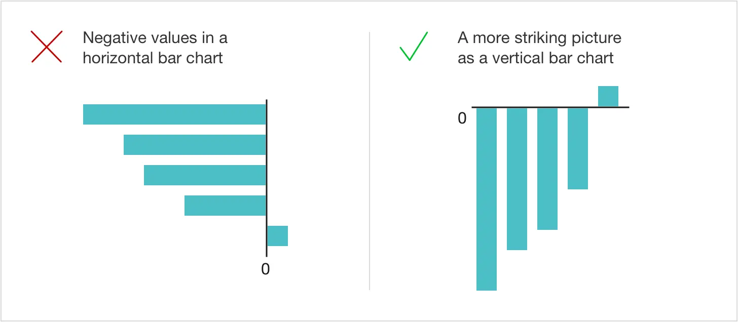
When creating a bar chart, it's best to avoid using horizontal bars if most values are negative. Instead, use vertical bars unless the labels do not fit underneath them. A picture with the bars below a horizontal baseline creates a stronger impression than one with bars to the left of a zero line.
Wrong direction
It is not recommended to display horizontal bars with negative values on the right side of the zero line, even if the data set does not contain positive numbers.

Left is negative, right is positive
Negative numbers should always be on the left side of the zero line, even if the entire data set consists of negative values. The right side of the baseline is reserved for positive numbers only. A zero baseline can be added to reinforce the negative zone.

Align the labels on either side of the baseline or keep them all flush left.

No two-way horizontal bars
When creating demographic charts that display the number of males and females, placing them on opposite sides of a baseline is common. However, this can be confusing as the left side of the baseline is typically reserved for negative numbers. To make comparisons between the two sets of bars easier, it is recommended to use a multiple-bar chart to plot the two data series.

Summary
Horizontal bar charts are useful when comparing data categories with long names or labels. They work well when you have a large number of data categories, as they can display a significant amount of text without overcrowding the chart or detracting from the key metrics. Horizontal bar charts are also great for comparing two or more values as their length is easy to compare. You might consider using a horizontal bar chart if you have big numbers.
Vertical bar charts are an excellent way to display changes in quantity over a period of time. They are particularly useful for showing trends, comparing different data groups, and highlighting differences between different data points. It's worth noting that historically, vertical bar charts have been more commonly used than horizontal bar charts. However, they are only ideal when less than ten categories are being shown.
The following article from the Data Visualization series will discuss pie charts in charts. Stay tuned and subscribe to our mailing list to ensure you get the following article on data visualization.
If you missed the previous five articles from the series, you can read them here:

